Janhavi Gawhale
My journey of using heuristics to evaluate designs and spot usability gaps.

I learned about heuristic evaluations through UX resources, 10 usability principles that act like a checklist for design quality.
Heuristic evaluation is a usability inspection method where designs are checked against a set of principles to quickly uncover problems. It’s a fast, low-cost way to find issues before real users are involved.
On paper, it felt easy, spot consistency issues, visibility problems, or mismatched system feedback. But in reality, applying them to complex aviation systems showed me how small gaps could cause huge user confusion.

When I first started, I explored different Miro templates to figure out how best to run evaluations. I learned that the number of auditors matters, having multiple perspectives makes the findings stronger. Collaborating with other designers gave me a much richer view than if I had done it alone.
I usually began by defining the scope of the evaluation: which flow, feature, or product area we were testing. Then I picked which heuristics to use. Sometimes I’d choose a few based on the scope, but other times I let the process flow naturally and used all ten, mapping violations to whichever principle they fit under.
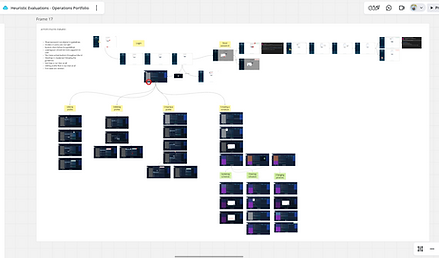
I also learned to let other designers do their evaluations independently first, without me influencing their opinions. I let auditors explore the application freely, then gave them a screen flow in Miro where they could drop sticky notes directly on the relevant screens to capture issues before we grouped them under heuristics.
After each evaluation, I made sure everything was captured in a structured way. Instead of just listing issues, I created a Miro grid template that included:
-
Screen reference – where in the flow the issue appeared
-
Heuristic violated – which principle it connected to
-
Description of issue – what the auditor observed
-
Severity rating – low, medium, or high impact
-
Recommendation – possible ways to improve
Later, I consolidated those notes into the grid so nothing got lost.
The final grid made it easy to walk through findings with the UX lead and dev lead. It helped the team not only see the issues clearly but also agree on prioritization based on severity and impact, rather than treating it like a random list of feedback.
Once the evaluation findings were documented, I didn’t want them to just sit in a report. I worked with the product owner and dev lead to translate the issues into a backlog of UX debt and enhancements.
-
High-severity issues were logged as UX debt that needed fixing soon, since they directly affected usability.
-
Medium/low-severity items were turned into enhancement stories that could be planned into future sprints.
-
Each item was linked back to the original heuristic and user flow, so anyone revisiting later could trace where it came from.
This way, the evaluation fed directly into the product workflow instead of being a one-off exercise. It also gave visibility to the team on where we stood in terms of UX quality and what we could improve iteratively.


As a new designer, running heuristic evaluations taught me more than just spotting usability issues.
It showed me how different teammates see problems in their own way, and how bringing those views together builds empathy and trust.
By letting auditors explore freely and capturing everything in a simple Miro grid, I made sure the findings felt like a team effort, not just mine. This helped me bond with developers and leads, and gave me confidence to connect user needs with real actions in the backlog.

Heuristics are powerful because they give structure to feedback.
They also help teams move from “this doesn’t feel right” to “this breaks a principle,” making conversations smoother and more productive.
And more importantly, they become actionable when shared, prioritized, and owned by the whole team.